Websites and applications are designed to capture our attention and encourage us to take action. But why do we do this? The answer lies in how the brain works when interacting with websites. Our brains are driven by the reptilian or primal brain, which focuses on survival and assessing danger. This results in the fight or flight response, where we either take action (flight) or flee (fight).
- UX and Psychology
- How the Primal Brain Reacts in User Experience Design
How the Primal Brain Reacts in User Experience Design
This understanding of how our brains work for user experience can help us create better websites and applications that are more engaging. By understanding what triggers the fight or flight response and how it impacts user experience, designers can create websites that will capture people’s attention, inspire them to take action, and ultimately increase conversions.
In this article, we’ll discuss how UX Designers can take advantage of the power of the primal brain to influence people’s behavior on a website — all while making sure users feel secure and comfortable.
The Fear of Familiarity and its Impact
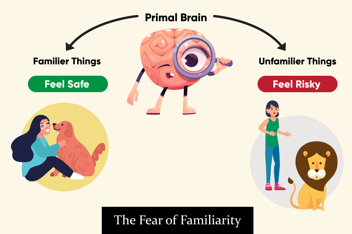
Have you ever experienced the feeling of familiarity while browsing a website? You may not know it, but it could be the primal brain trying to keep you safe. As humans, we love familiarity and often feel safer in familiar environments. Despite this instinctive feeling, UX designers should strive to make websites unfamiliar enough to keep users on their toes and engaged.
The Fear of Familiarity is an important concept when it comes to designing user experiences. It is essential for UX designers to consider how users will react when they come across something unfamiliar or slightly out of the ordinary. When done correctly, this fear can be used in UX design as a tool for keeping users engaged and exploring the website longer. However, if not done properly, it can have a negative effect on the user’s experience and have an adverse effect on user retention rates.

The Power of Hoarding Information
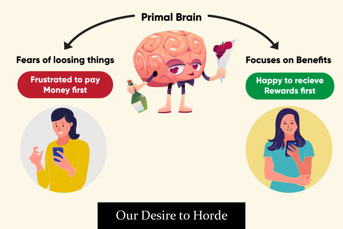
Information hoarding is an important concept to understand when it comes to UX design. It can be defined as the act of collecting and keeping as much information as possible, even if it isn’t immediately needed. By collecting and storing personal data, businesses are able to create more efficient, tailored user experiences. Although having the ability to use data is powerful, some may be scared of giving up control over it or even receiving nothing in return. This reluctance to part with valuable information can be seen as instinctive — it is our primary brain telling us not to demonstrate value without expecting something in return. Nonetheless, if done correctly, hoarding information can be essential and worthwhile for businesses.
In a world where data is increasingly becoming more valuable, it’s important to understand how to use it wisely and to your best advantage. It’s understandable that the fear of losing can make people and companies become protective over their information. With careful consideration and focus on the benefits that products or services can provide, you can demonstrate why it is valuable and how it will return value back to you in the end. Hoarding information can be a powerful tool when used correctly in UX design.

Failure to look forward
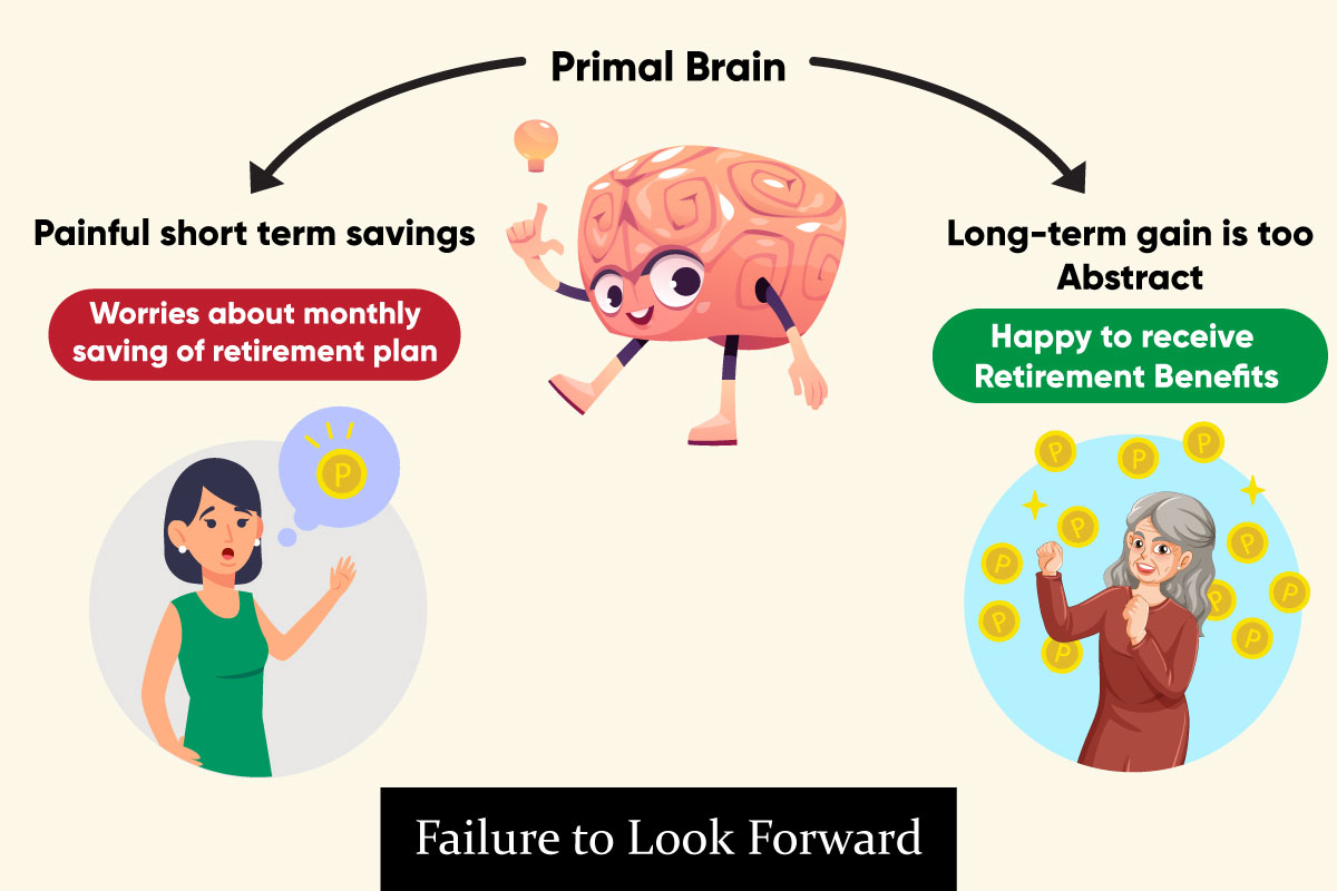
This phenomenon is also can be known as hyperbolic discounting, where people tend to choose immediate rewards over future rewards, even if the future rewards are greater. This behavior is often seen in children and can carry over into adulthood. In UX design, it’s important to consider this tendency towards immediate rewards and find ways to balance it with long-term benefits.
For example, a website or app that consistently provides immediate rewards, such as badges or points, may be more appealing to users and result in more engagement than a site or app that provides delayed rewards. Similarly, designs that use instant gratification tactics, such as gamification, can be more effective in retaining users than designs that rely on long-term motivation. Additionally, offering a mix of immediate and delayed rewards can help keep users engaged while also encouraging them to strive for long-term outcomes. However, it’s important to balance immediate rewards with long-term benefits, such as providing users with valuable information or helping them achieve their goals, to ensure a well-rounded user experience.

As digital users, we all face the challenge of understanding unfamiliar user interfaces and navigating our way through them. However, understanding the basic behaviors of humans and harnessing the power of familiarity can be used to create better user experiences. By recognizing our primal brain’s tendencies to hoard information and use it as a tool to create a pleasant experience for users, companies can effectively design user experiences that are both enjoyable and efficient. With this approach, companies can ensure that their customers have an intuitive experience while using their products or services.

I found this article incredibly useful—thanks
for the great content!
This site truly hass all oof tthe infoo I needed about thuis subject and didn’t know whho too ask.
Everything is very open with a really clear description of the issues. It was definitely informative. Your site is useful. Thank you for sharing!
May I simply say what a comfort to discover somebody who genuinely knows what they are talking about over the internet. You actually understand how to bring a problem to light and make it important. More people ought to check this out and understand this side of the story. I cant believe you arent more popular because you surely possess the gift.