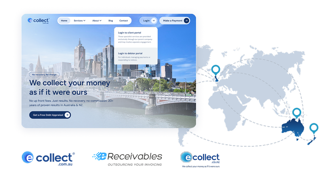
A debt collection group operating across multiple countries and entities deserves more than a fragmented online presence. Even the login entry point was rethought, so clients and debtors instantly know where they belong. Three sites live. Two more in the works. One cohesive group identity finally coming together online.
This isn’t a vanity score. 100% SEO, 100% page speed, 99% performance, and 94% accessibility is what happens when UX, development, and SEO stop working in silos and start working as one team toward the same goal. The design set the foundation. Talented developers built it right. SEO best practices shaped every decision from the ground up. The result is a site that doesn’t just look better than before — it performs better in every measurable way.
GT Matrix grade
A
No one lands on a debt collection site feeling great about it, regardless of which side they’re on. Drowning them in wall-to-wall text with heavy cognitive load, the moment they arrive only makes it worse. The redesign brought visual structure, breathing room, and a content layout that lets anyone move through the site without friction. Clear enough to skim, trustworthy enough to stay, and designed to build brand confidence with every scroll for clients and debtors alike.
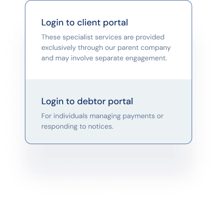
During project discussions, the terms client and debtor kept causing confusion among the team. That was the hint to think it as a research, no formal study needed. If it wasn’t immediately obvious to the people building the site, it certainly wouldn’t be obvious to someone arriving under stress to manage a payment or chase a recovery. That’s where the guided login experience came in, with clear labels and plain language explanations under each option so every visitor knows exactly where they belong from the first click.
No one lands on a debt collection site feeling great about it, regardless of which side they’re on. Drowning them in wall-to-wall text with heavy cognitive load, the moment they arrive only makes it worse. The redesign brought visual structure, breathing room, and a content layout that lets anyone move through the site without friction. Clear enough to skim, trustworthy enough to stay, and designed to build brand confidence with every scroll for clients and debtors alike.
for visiting my portfolio and
contacting me!
I'll get back to you shortly! Would you like to see my case studies?