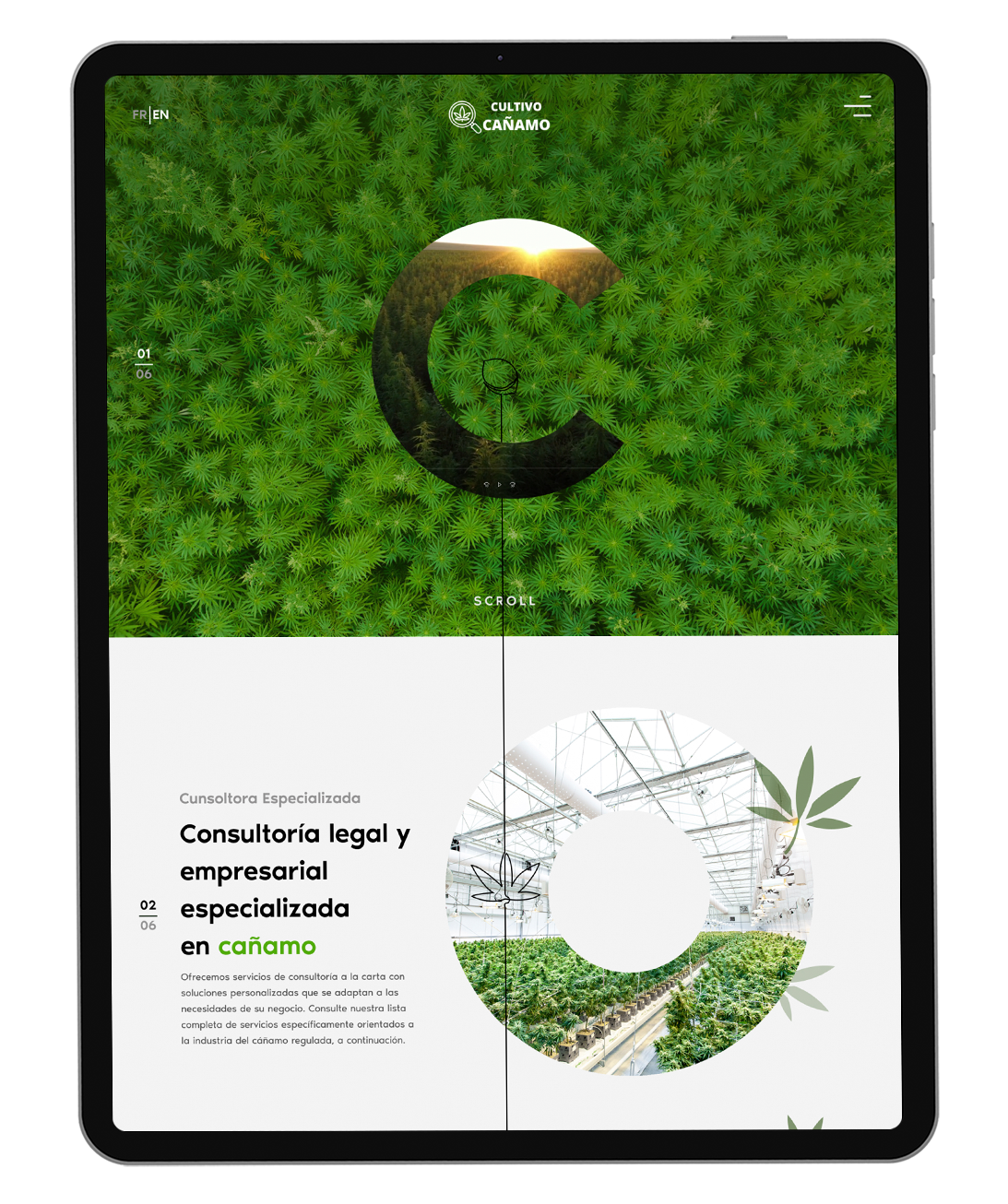
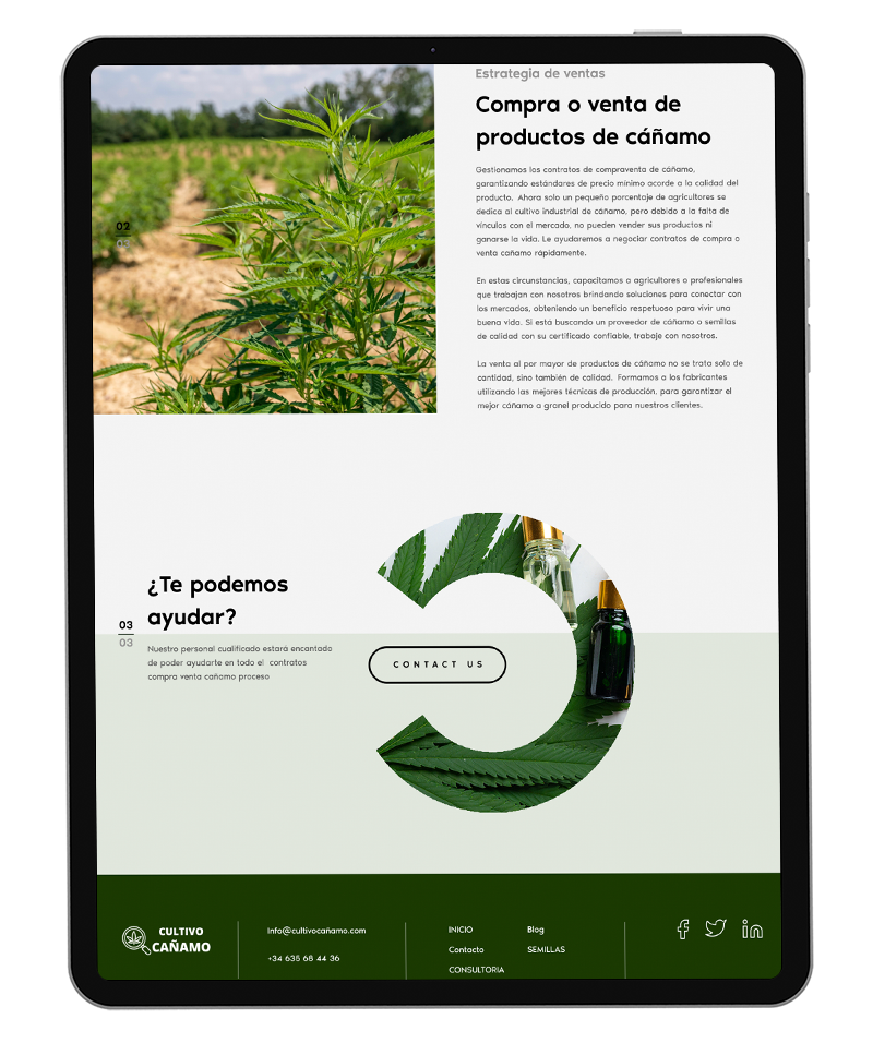
The consulting firm “Cultivo Cañamo” specializes exclusively on hemp cultivation. They are consultants for cannabis cultivators all around Europe. Cultivo Cañamo is more than simply a consulting company; their services also include custom – made solutions that are adaptable to meet the particular requirements of each client’s business.

Cultivo Cañamo came with a clear creative brief — an interactive, scroll-driven experience where the design responds to exactly how fast or slow the user moves through the page. He wanted a video hero, but not the typical full-screen video you see everywhere. The real challenge wasn’t the ideas themselves. It was finding a way to translate an ambitious creative vision into something technically buildable, without stripping away what made it special in the first place.
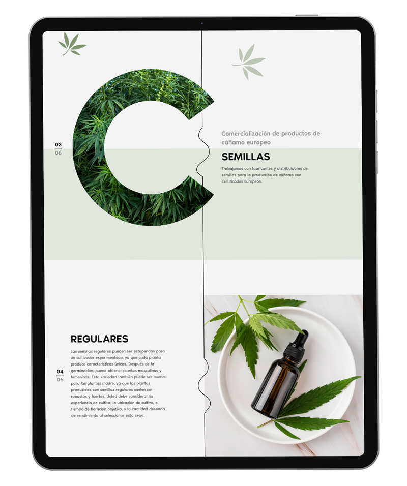
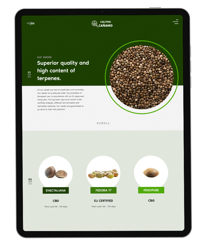
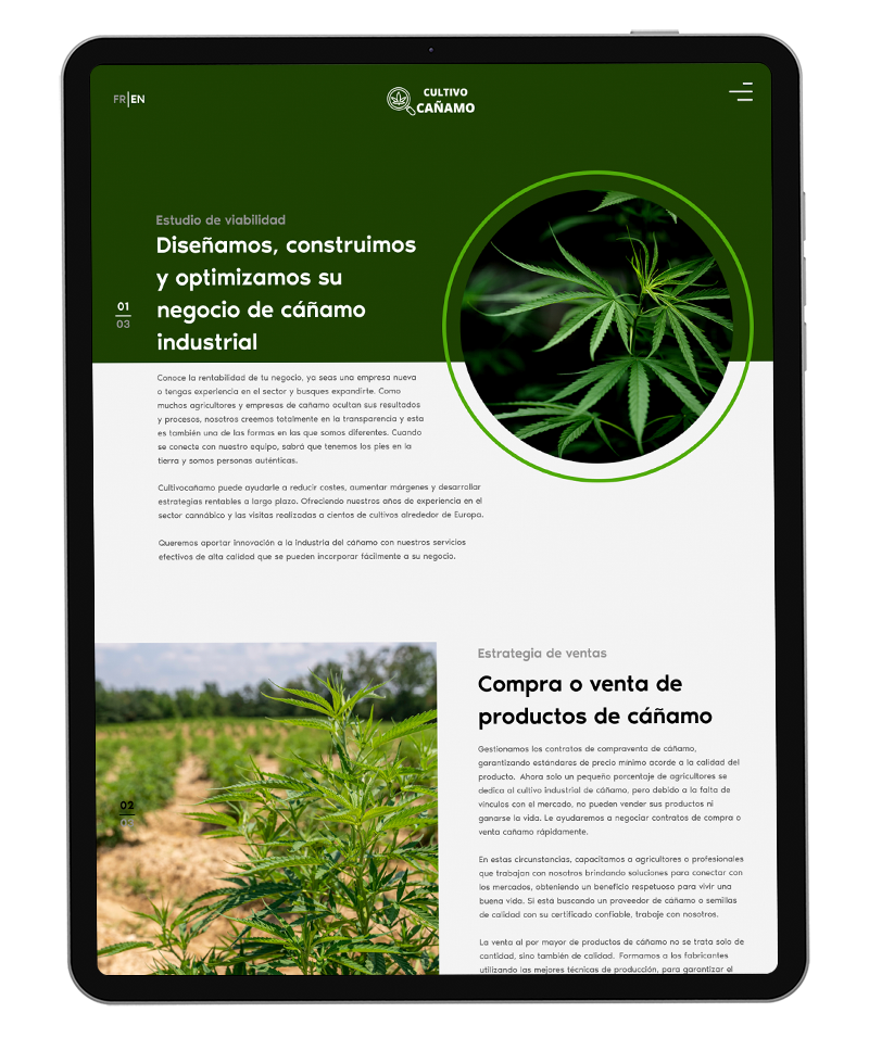
Bringing this to life meant going well beyond standard UX research. The team ran thorough brainstorming sessions to close the gap between what the client imagined and what could realistically be built. Alongside that, a full audit of the existing site uncovered deeper issues with information architecture and content structure, so the entire site was restructured from the ground up. Every change was communicated and signed off with the client throughout, keeping the relationship strong while pushing the boundaries of what the final product could be.

for visiting my portfolio and
contacting me!
I'll get back to you shortly! Would you like to see my case studies?