Project Information
| Project | Cross-platform tool to help people learn first-aid |
| Institute | Coursera UX Design Certificate Program |
| Platform | Mobile App, Website and Tablet mode |
| My Role | UI/UX Designer |
| Responsibilities | Conducting interviews, paper and digital wireframing, low and high-fidelity prototyping, conducting usability studies, accounting for accessibility, and iterating on designs. |
| Tools Used | Figma | Adobe illustrator | Adobe Photoshop |
Case Study
The Product
SaveLife is a cross-platform tool designed to help people learn first-aid and save lives at risk. Any of us may be exposed to a situation where we need to save someone’s life before medical help arrives. To be prepared for such scenarios, it is essential that we all have basic first-aid knowledge. Lack of skills or knowledge in first-aid could harm the life of the person we are trying to save. Thus, we developed a cross-platform tool to learn first-aid and to know when to seek a doctor’s help. Furthermore, it is made more useful by allowing users to book an ambulance or contact a medical center based on their current location at any time.
Project Duration
December 2022 to January 2023.
The Problem
It's absolutely essential to be equipped with first-aid knowledge in case of any emergency, especially if no medical help is available immediately. Without the right kind of skillset and understanding, we won't be able to do much to save someone's life in such situations; it could even end up being detrimental for them.
The Goal
Implement a cross-platform tool to learn first-aid and be aware of when to go to a doctor. Make it more useful by allowing users to book an ambulance or contact a medical center at any time based on their current location.
User research: summary
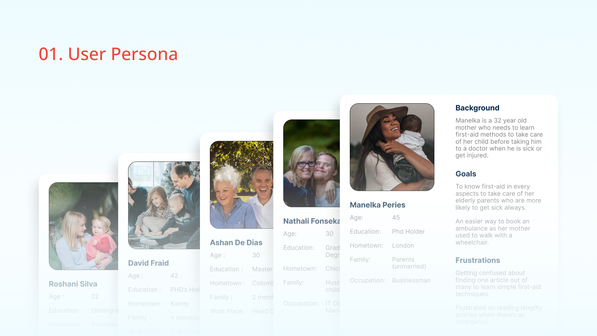
I conducted several open interviews with the community to identify their requirements first. Then, I conducted interviews with selected users and created empathy maps to understand the users I was designing for and their needs. Research has identified a primary user group of people who have children or adults at home who often get sick or injured.
This user group made me understand their requirements more clearly by confirming that the purpose of designing a first-aid learning app is really helpful for them. They were especially pleased to have an app that covers both first-aid guides and emergency support on their phones at all times.
UI Design Process
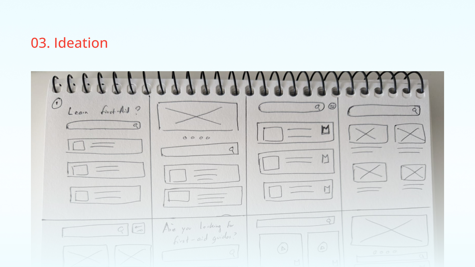
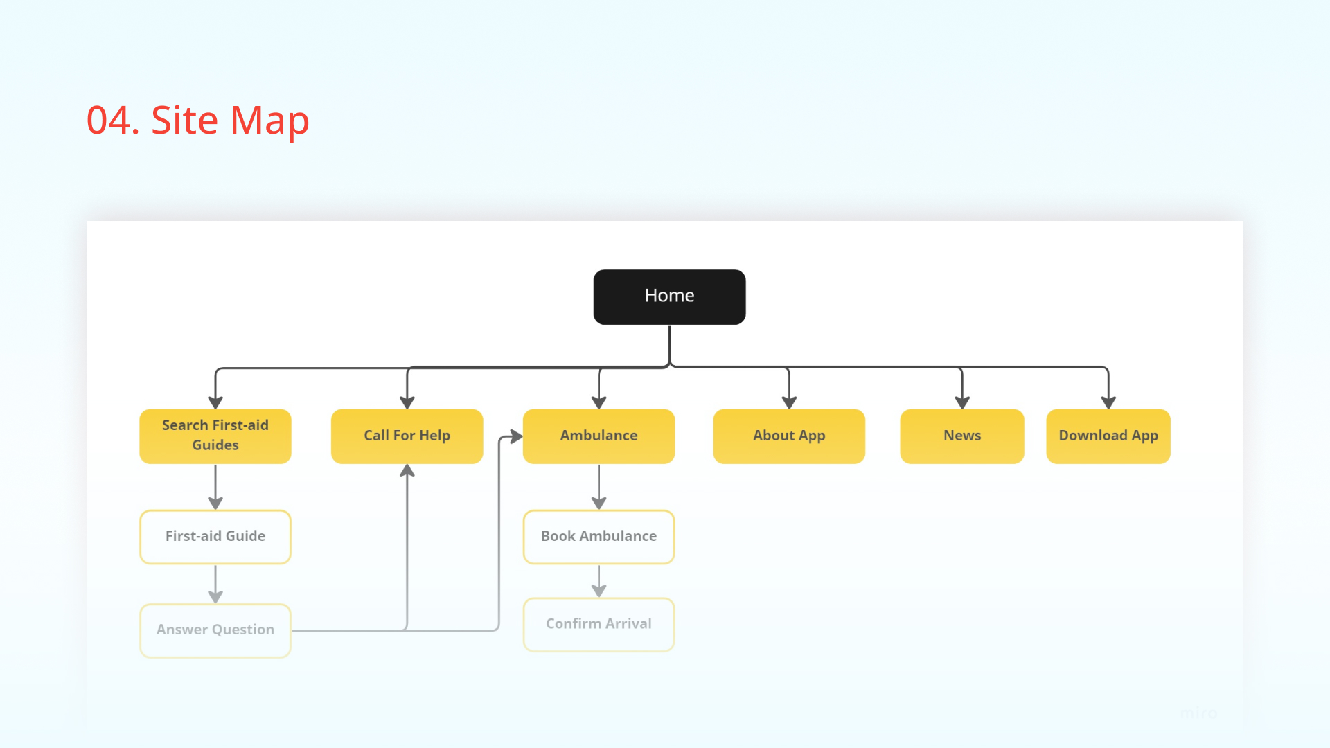
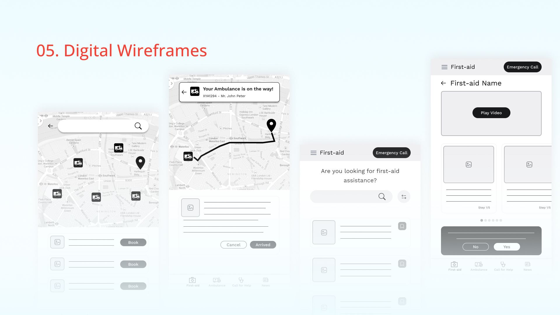
Once the digital wireframes were completed, I created a low-fidelity prototype. The primary user flow I connected was searching for and opening first-aid guide articles, as well as calling for help or booking an ambulance, so the prototype could be used in a usability study. View the First-aid App low-fidelity prototype
Usability study: findings
I conducted two rounds of usability studies with the selected participants for my app. The findings from the first study helped me to design from wireframes to mockups. The second study used a high-fidelity prototype and revealed which aspects of the mockups needed refining.
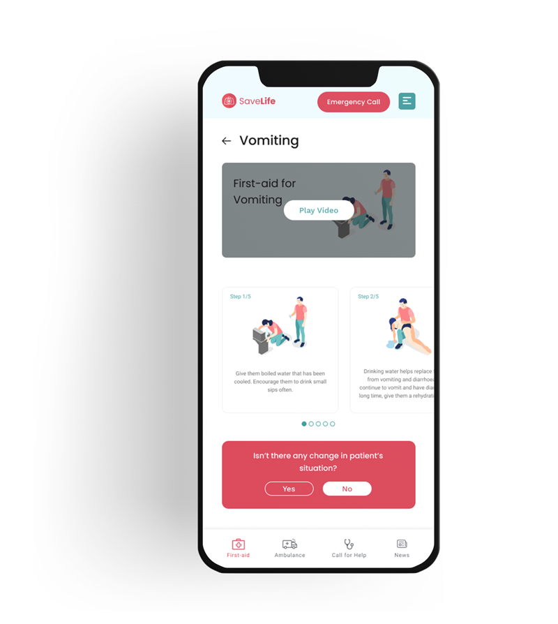
- Providing video of first-aid guide for people who are not interested in reading a guide when there’s an emergency.
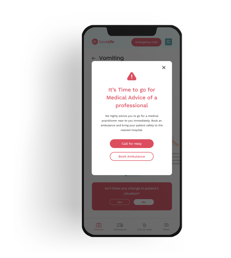
- Guide users when to look for a doctor based on the answers get for some questions on the first-aid guides.
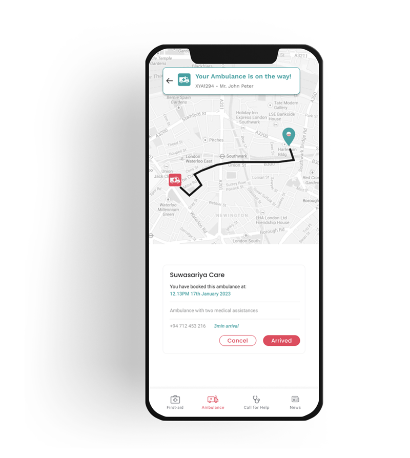
- Keep user on update about the live location of the ambulance they’ve booked.
Accessibility considerations
- Clean and clear view with better spaces to make it quickly readable for anyone who uses the app. This was considered highly as this app might be used by most of people when there’s an emergency.
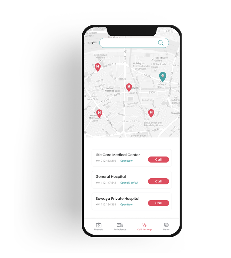
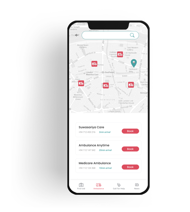
- Use of map view for the finding of medical support or ambulance make users feel trustworthy about the service. So it makes users to see how many services are available for them with clear view of distance gap.
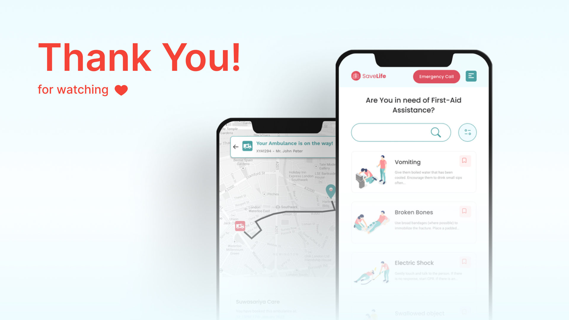
- Tracking ambulance driving path shows users that the booked ambulance is on its way to there. It makes users feel more safer about the service and can arrange other things as per the distance of the ambulance to their live location.
High-Fidelity Prototype
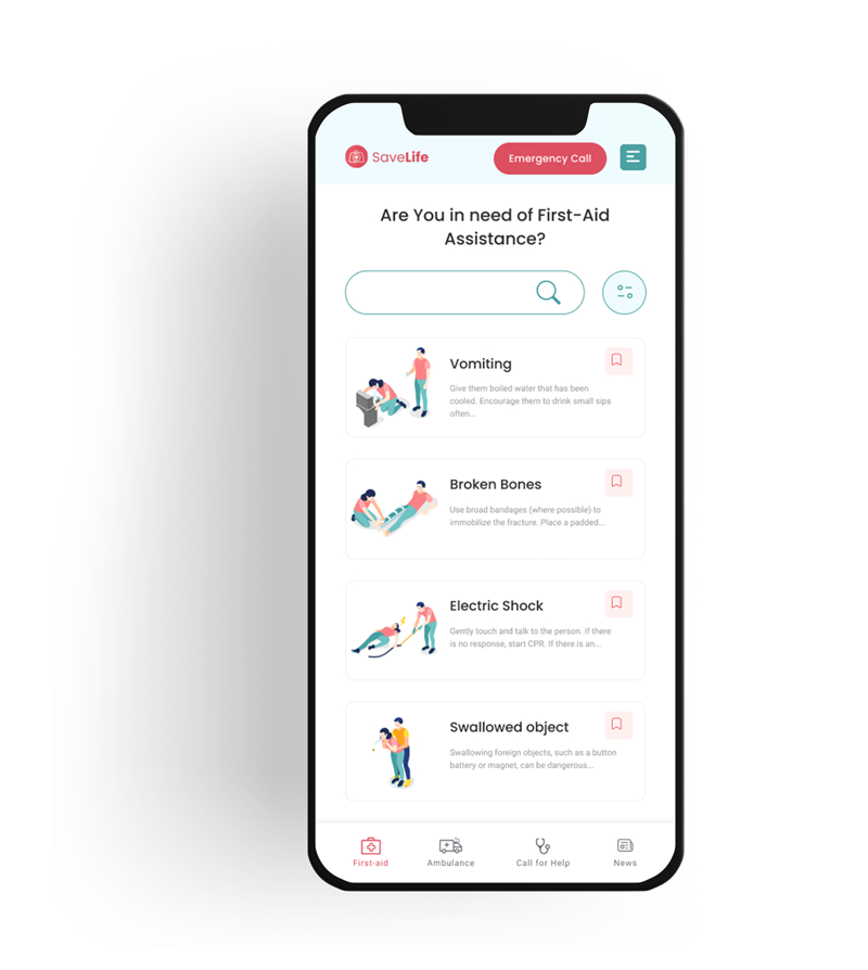
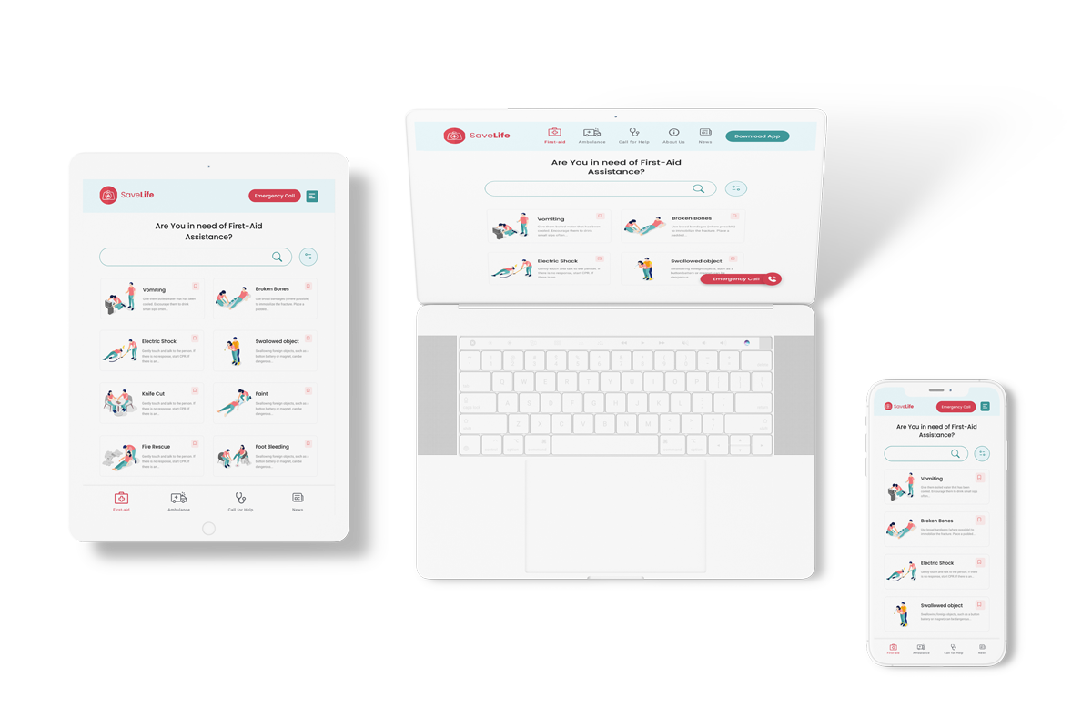
Responsive Designs
